KFD “Moses Signature Series”

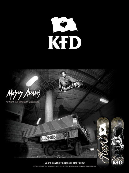
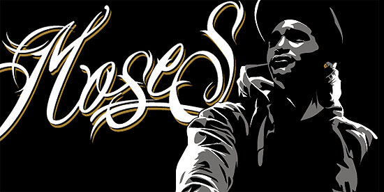
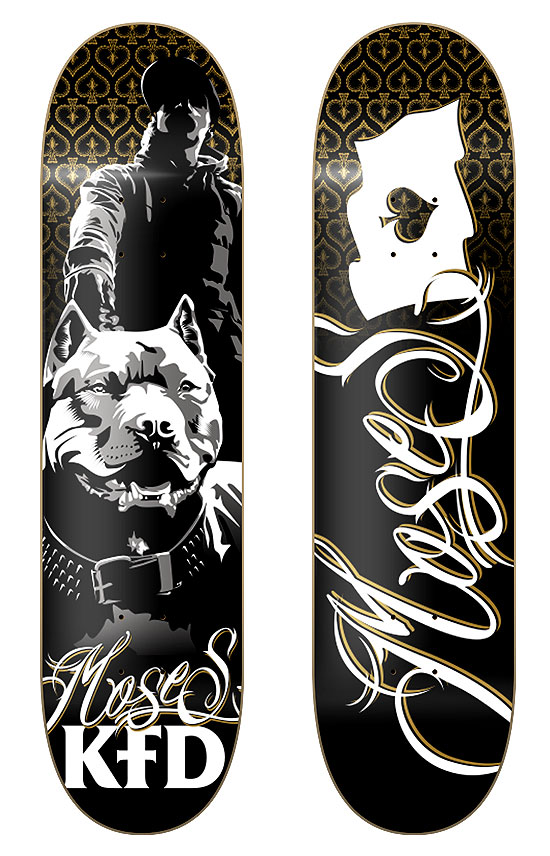
Moses Adams is KFD’s pro skater and I was asked to design his pro boards. Moses is a little different from the other guys on the team in that he is more into Hip Hop, where as most of the others on the team are more rock n roll type of guys. In his boards I worked to incorporate this element of his personality into the graphics while still staying true to the KFD brand identity. I chose to use gold, white, and gray as the spot colours, and created a font that I wrote his name in. One of Moses’ personal requests was that his pitbull be included in one of the graphics, which was also fun to illustrate. We ended up going with two boards, one using his name in the font I created, and the other with the illustration I did of him and his dog.
moses_1

moses_decks

moses_ad

12/11/09   TAGS:


KFD “Search and Destroy”

Search and Destroy was the theme given to me for this job, and the guys at KFD wanted to use a pirate ship in the design in some way. I had never illustrated a ship before so it was pretty fun doing this one. Getting all the elements of the ship into the drawing was quite a task, and I never thought getting water to work would be so hard. At the end of the day the client was really happy with the result, and I like they way it turned out as well. I’m looking forward to getting one of these decks when they finish production

ship1

ship2

ship3

12/11/09   TAGS: , ,


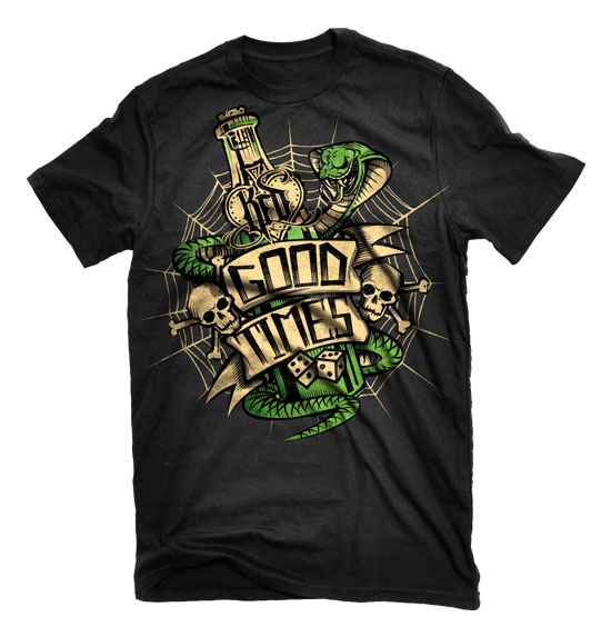
KFD Skateboards “Good Times”

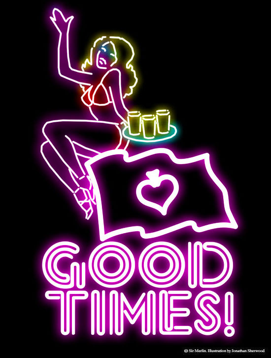
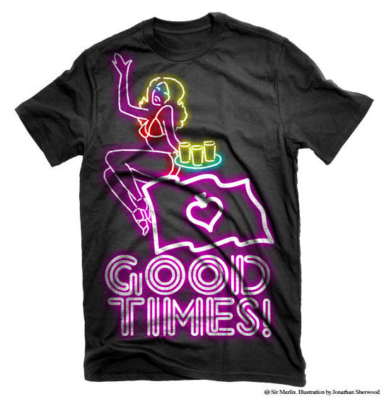
Good Times is a theme that runs through everything that KFD does, and for this design they asked me to do a deck and T-shirt that went with this theme. Partying, girls, and beer are always good ingredients for a good time, so I chose images along those lines for the illustration. I based the design on a neon light you would find outside a bar, and incorporated the KFD flag as one of the design elements. The guys at KFD were stoked with this design, and I’m looking forward to seeing the finished items.

good_times_1

good_times_shirt

good_times_board

12/11/09   TAGS:


KFD “80’s Series”

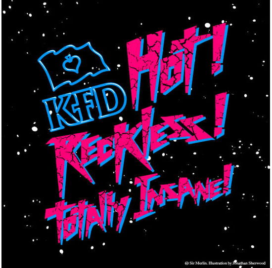
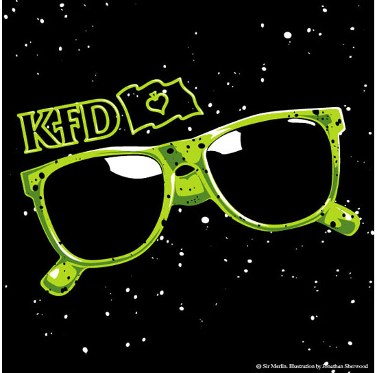
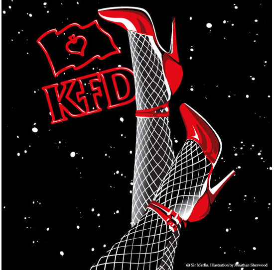
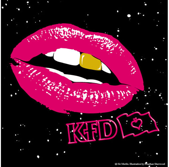
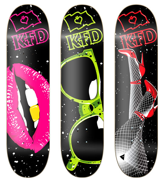
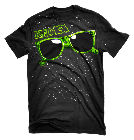
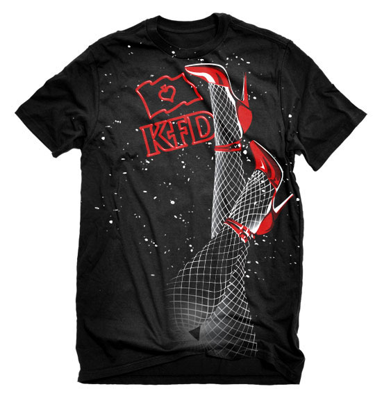
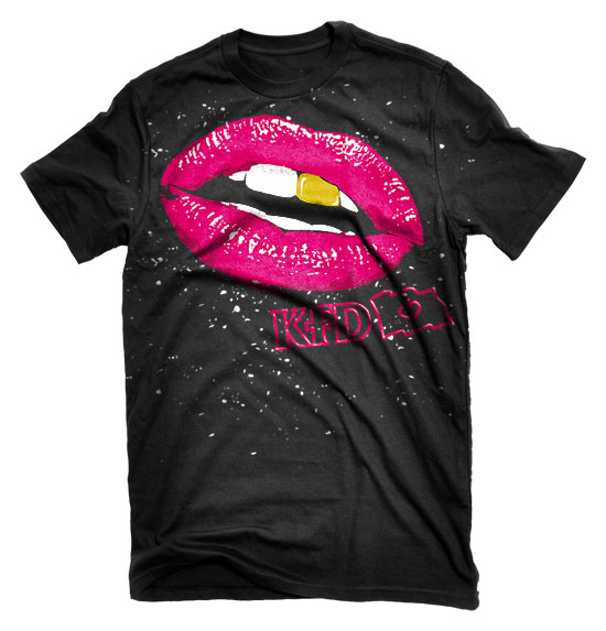
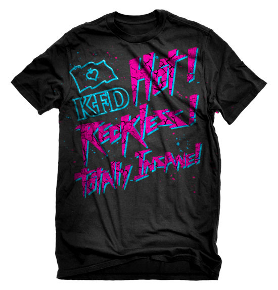
For this job KFD were looking for a range of 3 decks and T-shirt graphics for a new series. My inspiration originally came from the 80’s skate movie “Thrashing” where I got the strap line “Hot, Reckless, Totally Insane”. Building on that I chose subject matter that suited the in your face nature of the KFD brand, and treated them using 80’s colours and techniques. This is one of my favorite series that I have done for KFD.

80_1

80_2

80_3

80_4

80_decks

80_shirt1

80_shirt2

80_shirt3

80_shirt4

09/11/09   TAGS:


KFD “Tattoo Series”

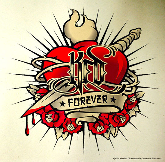
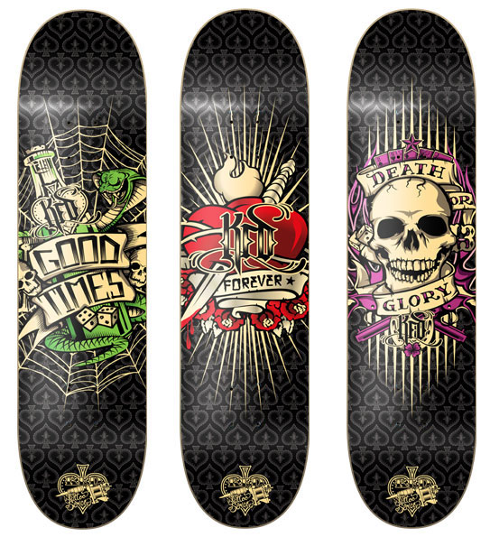
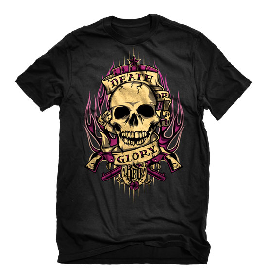
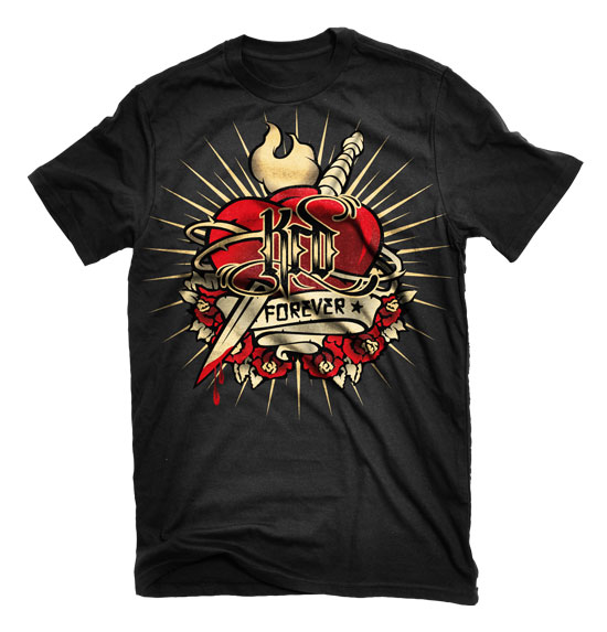
For this range KFD were looking for something inspired by tattoo art. As a brand KFD is very much a “skate or die” type of company, so I set out to design graphics that conveyed a message that would be relevant to what they are all about. The three slogans I chose were, KFD forever, Death or Glory, and Good Times. After illustrating these three concepts I then flexed them out over the decks and T-shirts.

kfd-tattooseries-forever

kfd-tattooseries-deathorglory

kfd-tattooseries-goodtimes

kfd-tattooseries-bw

tattoo_boards

tatt00_shirt1
tattoo_shirt_2

tattoo_shirt_3

07/11/09   TAGS: , , , ,


KFD “Skull n Roses”

KFD were looking for a generic deck graphic that they could roll over from one season to the next. An older design using a skull print had always been a good seller for them and they wanted to freshen it up. Starting with the basic layout from the old graphic I set about designing a board that looked new but wouldn’t age quickly when it was carried over. Three classic images that always work together are skulls, roses, and spider webs, so I decide to use these three elements in revising the graphic. This was the first time I had illustrated roses and I really enjoyed it. They are rather complex shapes, and applying the line and colour to reflect that was interesting challenge. At the end of it I think the board turned out really well, and will hopefully be a good seller for KFD for some time to come.

skull_1

skull_2

skull_3

skull_4

06/11/09   TAGS: