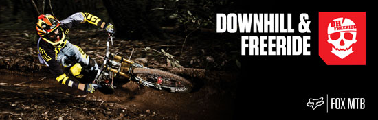
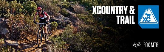
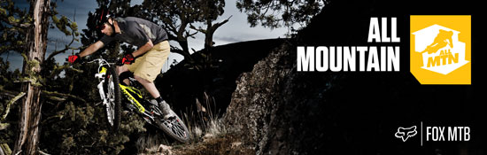
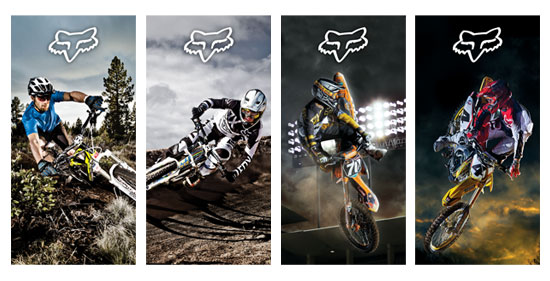
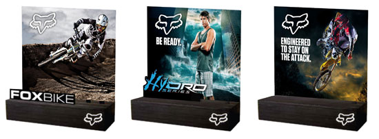
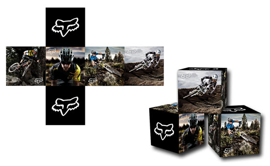
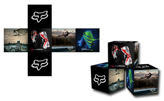
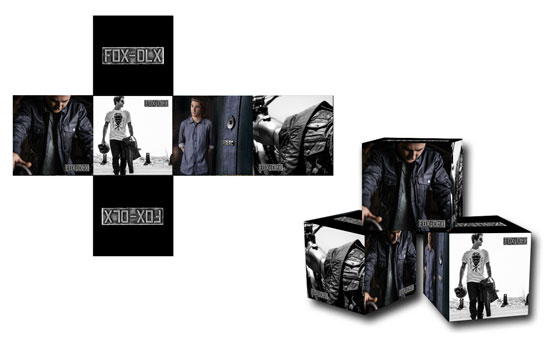
A collection of point of sale items I designed for Fox Head Europe. These were seasonal pieces that were placed in to dealers around Europe. Some were designed specifically to meet a certain stores needs (Giant Bicycles concept store), while others were generic and went out to all dealers.
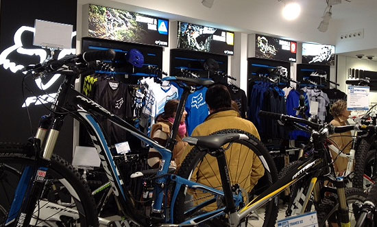
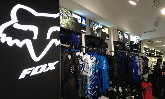
Wall display units in the Giant Bicycles concept store Madrid:
In 2011 the Fox Europe surf team went on a road trip through Portugal, France, and Spain. The trip was documented in Surf Europe magazine, and photos taken during the trip were used in Fox print advertising and Point of Sale during 2011 / 2012. Below is an edit I did of the trip.
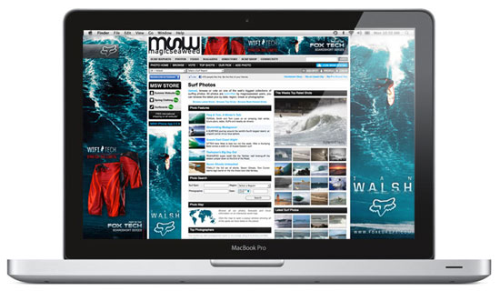
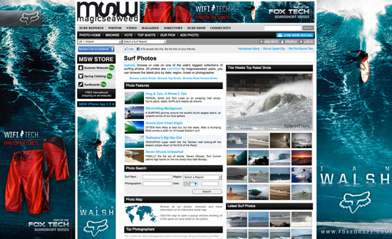
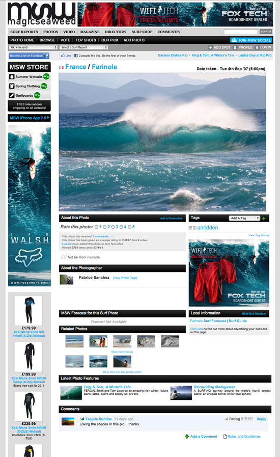
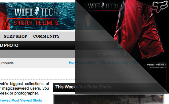
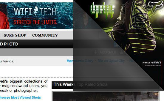
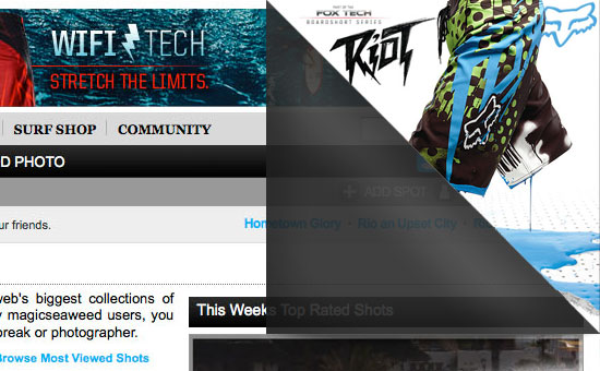
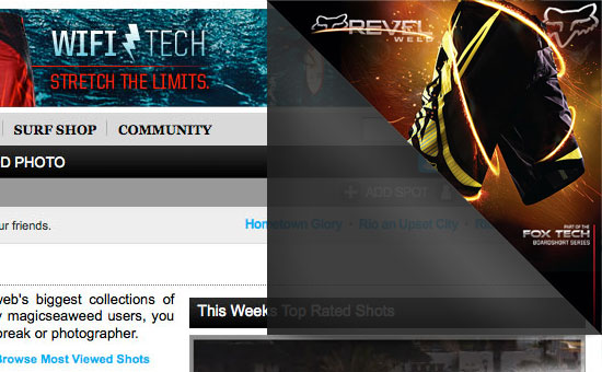
In 2011 Fox Heads main focus after Motocross was the surf market. As part of our push into this market we ran a number of campaigns. Below if one I created for Magic Seaweed, Europe’s largest online surf portal. The campaign linked back to a microsite that featured the new line of product, and then directed them to an online store. The campaign ran for a month, and during that period online sales of Fox boardshorts increased 60%.
These were a series of Illustrations I did for Killer LTD’s new apparel line. The Killer projects are always fun to work on due to their “Live free or Die” attitude. All 3 prints were inspired by Killers dagger icon, as well as the tattoo culture that goes along with the brand. All the designs were created in Adobe Illustrator, and printed on black shirts using discharge inks.
I was asked to design a title logo for an upcoming TV show called “Deadliest Journeys”. The show goes through a series of the worlds most dangerous journeys on land and sea, and covers trips both taken on foot and via vehicle. I was asked to use a font that was strong, and could communicate the “epic” nature of the show. I then chose to use geographical lines inside the font to emphasise that these journeys were rough and off the beaten path. I also contrasted the metallic finish of the font against organic background textures showing that the journeys involved both machines and rural means of transport. Finally I added a stamp styled sub heading where the editors could add the names of each episode.
After I handed over the logo to the production guys they animated it so that they could use it in the titles. Im pretty stoked with what they did, and cant wait to see this show on air!
This is the first print ad for Verb for an upcoming issue of Session Skate Mag. Verb is a new brand in the RSS stable that revolves around skate, music, and art. The idea here was to keep the colours vibrant and fresh so we processed the pics with high contrast and saturation. The focus of all the ads going forward will be on the people involved as they define the brand. Simon Stipcich is a skater on the team and he was the subject for this ad. A simple line of copy highlighting his character (and in turn reflect what the brand is about) finished off the ad. “Simon Stipcich: Skateboarder, creative thinker, aspiring hippie, pushing forward.”