Deadliest Journeys
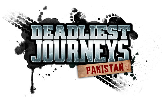
I was asked to design a title logo for an upcoming TV show called “Deadliest Journeys”. The show goes through a series of the worlds most dangerous journeys on land and sea, and covers trips both taken on foot and via vehicle. I was asked to use a font that was strong, and could communicate the “epic” nature of the show. I then chose to use geographical lines inside the font to emphasise that these journeys were rough and off the beaten path. I also contrasted the metallic finish of the font against organic background textures showing that the journeys involved both machines and rural means of transport. Finally I added a stamp styled sub heading where the editors could add the names of each episode.
After I handed over the logo to the production guys they animated it so that they could use it in the titles. Im pretty stoked with what they did, and cant wait to see this show on air!


