Some fresh stuff!

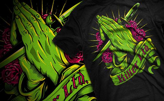
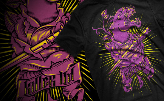
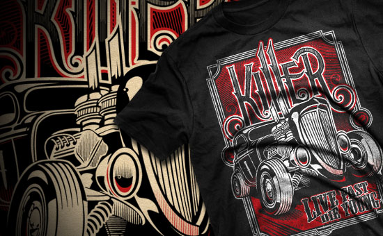
Ive just added 3 new illustrations / T-shirt graphics to my portfolio. Click HERE to check them out. All of them have been done for the 2010 Killer ltd range. Im really happy with how these have turned out, and cant wait to see the finished products.

03/03/10   TAGS: ,


Killer Ltd T-shirt Illustrations.

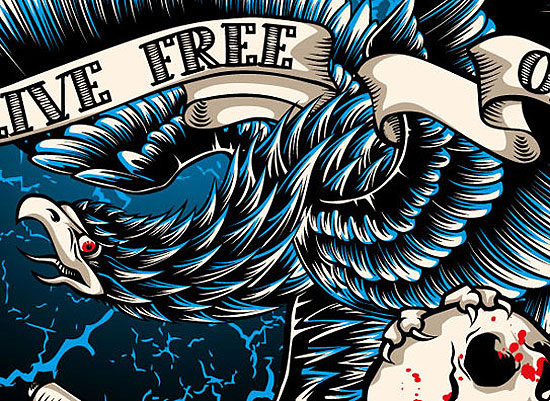
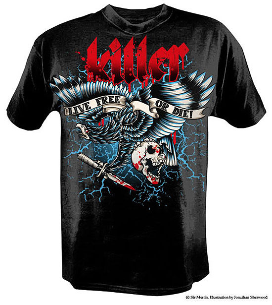
These were a series of Illustrations I did for Killer LTD’s new apparel line. The Killer projects are always fun to work on due to their “Live free or Die” attitude. All 3 prints were inspired by Killers dagger icon, as well as the tattoo culture that goes along with the brand. All the designs were created in Adobe Illustrator, and printed on black shirts using discharge inks.

03/03/10  


A T-shirt Blog

tshirt_blog

The good folks at “A T-shirt Blog” just featured the CSL shirt I designed for the Highway Collective. Head on over there and see what they have to say. You can check out the feature HERE, as well as the rest of the shirts I did for the Highway Collective HERE. The A T-shirt Blog site is updated regularly and has tons of rad T’s up there so make sure you look around.

05/12/09   TAGS: ,


Killer “Live Free or Die”

The “Live Free or Die” shirt has to be one of the most mammoth vector illustrations I have done. Killer wanted a graphic T-shirt with a “Hesh” feel to it. The brief was to go full colour and create something with a strong message. The statement “Live Free or Die” is one that reflects what the Killer brand is all about, and no creature is as synonymous with freedom as an eagle. I started the illustration with the idea of placing it on the chest as if it were a big chest piece tattoo. After finishing the illustration in black line work, I then added colour, and then finally the killer text logo to finish it off. By the time I was done I didn’t want to look at a vector line for weeks, as drawing and colouring every feather too almost 3 days to complete. The end result though was well worth the effort, and I cant wait to see these when they come back from the printers in a week or so time.
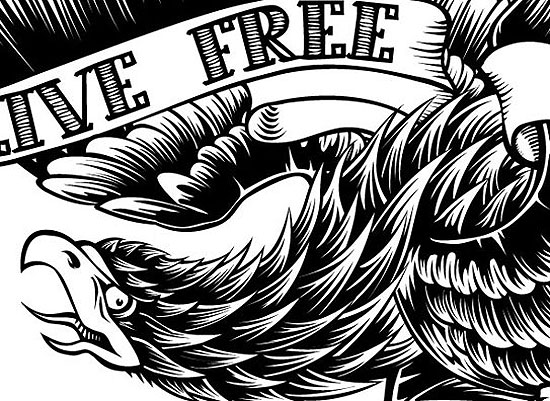
eagle1
Close up of line work.

eagle2
Close up of colour detail.

eagle3
Full bird illustration.

eagle4
T-shirt mock up.

12/11/09   TAGS: ,


KFD “Search and Destroy”

Search and Destroy was the theme given to me for this job, and the guys at KFD wanted to use a pirate ship in the design in some way. I had never illustrated a ship before so it was pretty fun doing this one. Getting all the elements of the ship into the drawing was quite a task, and I never thought getting water to work would be so hard. At the end of the day the client was really happy with the result, and I like they way it turned out as well. I’m looking forward to getting one of these decks when they finish production

ship1

ship2

ship3

12/11/09   TAGS: , ,


Vendetta Cartel T-shirt

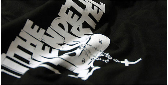
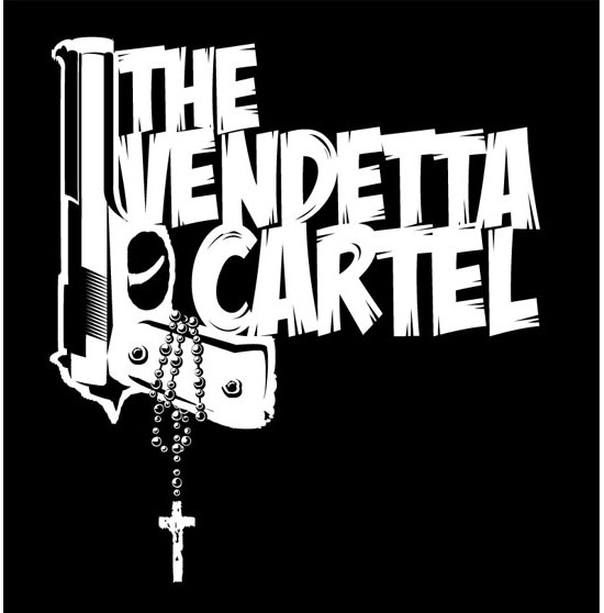
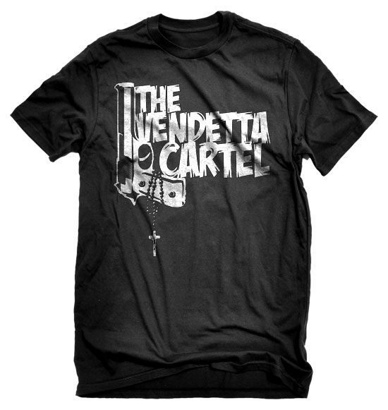
The Vendetta Cartel is a Johannesburg based punk band and they asked me to design a T-shirt graphic for them. The band sings songs revolving around social issues and life in modern day South Africa. For the T-shirt graphic I wanted to use an image that reflected the hard hitting nature of the bands songs, tied in with their name, and also had a taste of latin influence as the singer originates from South America. In the end I think the graphic met all those criteria, and the shirt design was well received by the band and their fans.

vendetta_1

vendetta_2

vendetta_3

12/11/09   TAGS: