KFD “Tattoo Series”

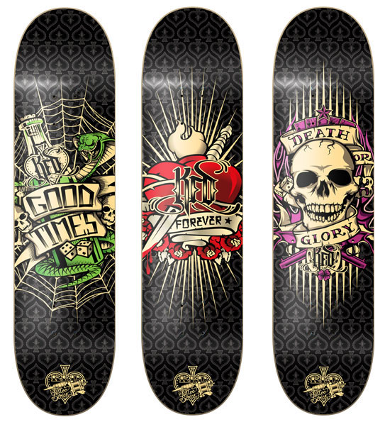
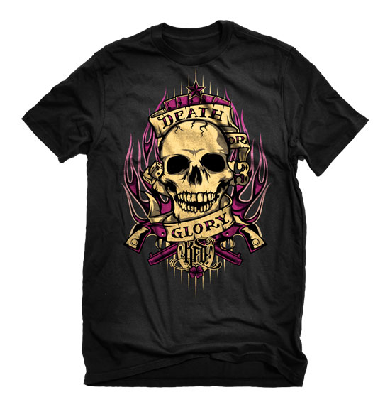
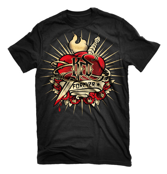
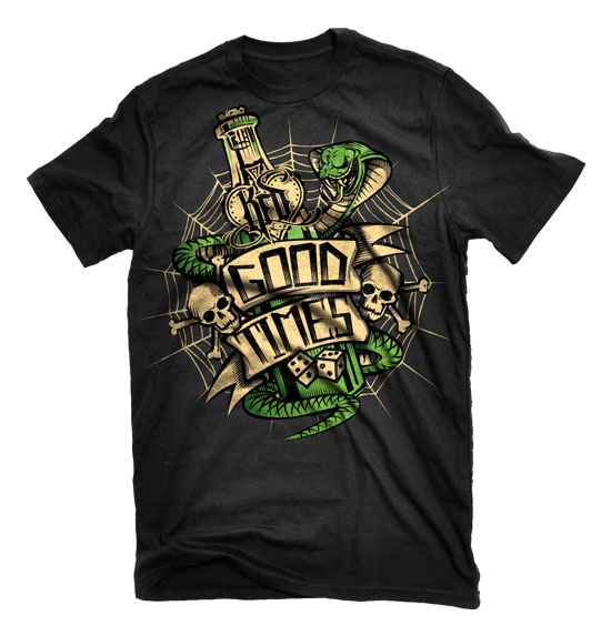
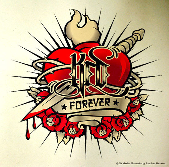
For this range KFD were looking for something inspired by tattoo art. As a brand KFD is very much a “skate or die” type of company, so I set out to design graphics that conveyed a message that would be relevant to what they are all about. The three slogans I chose were, KFD forever, Death or Glory, and Good Times. After illustrating these three concepts I then flexed them out over the decks and T-shirts.
kfd-tattooseries-forever

kfd-tattooseries-deathorglory

kfd-tattooseries-goodtimes

kfd-tattooseries-bw

tattoo_boards

tatt00_shirt1
tattoo_shirt_2

tattoo_shirt_3

07/11/09   TAGS: , , , ,


Marcus Maschwitz “Photography”

My buddy Marcus is a kick ass photographer, and I was real excited when he asked me to design his corporate identity. He was in the process of moving and needed a fresh look and portfolio to show new customers his work. I came up with the idea of keeping the portfolio very minimalist so that it didn’t detract from the photos themselves. I designed a simple logo that would allow folks to see what he did right away, and used a clean font for his name. The idea was to deliver large format glossy pics to potential customers in a high quality black envelope. Each photo would have its relevant info printed on the back, and the envelope its self would have his logo matt foiled on the front. All in all I wanted the package to look very high end and allow all the attention to fall on his pictures as opposed to the portfolio its self. I still get stoked every time I see him do a photo update on his blog and this logo is on the pics.

marcusmaschwitz-photography-concept

marcusmaschwitz-photography-logo

marcusmaschwitz-photography-buscards

marcusmaschwitz-photography-letterhead

marcusmaschwitz-photography-envelopes

07/11/09   TAGS:


Kicks + start (kickstart)

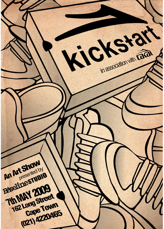
I designed this poster for an art show that Lakai Footwear was hosting. The show was called Kickstart (kicks + art), and involved a number of artists painting onto blank Lakai shoes and loafers. Because the shoes in this show were a blank canvas for the artists I tried to create a poster that put emphasis on the shoes, but also reflected that fact that they were to be used as part of the art. In doing so I illustrated the shoes so that they looked like a colour by number, and then used a rough canvas texture in the background. All of the information about the show was placed in shoe boxes so as to keep the focus on footwear.

kickstart

06/11/09   TAGS:


KFD “Skull n Roses”

KFD were looking for a generic deck graphic that they could roll over from one season to the next. An older design using a skull print had always been a good seller for them and they wanted to freshen it up. Starting with the basic layout from the old graphic I set about designing a board that looked new but wouldn’t age quickly when it was carried over. Three classic images that always work together are skulls, roses, and spider webs, so I decide to use these three elements in revising the graphic. This was the first time I had illustrated roses and I really enjoyed it. They are rather complex shapes, and applying the line and colour to reflect that was interesting challenge. At the end of it I think the board turned out really well, and will hopefully be a good seller for KFD for some time to come.

skull_1

skull_2

skull_3

skull_4

06/11/09   TAGS:


Typography

This was just a fun job I took on for a friend of mine. He wanted a tattoo and asked me to design it for him. I really enjoy working with typography so had a lot of fun putting this one together. I got a bit carried away with all the decorative elements, and by the time I was done my buddy thought it was a bit over the top for him. I still really enjoyed doing it though, so thought Id put it up here in any case.

tat_1

tat_2

tat_3

tat_4

06/11/09   TAGS: ,


Revolution “Peace Weapon”

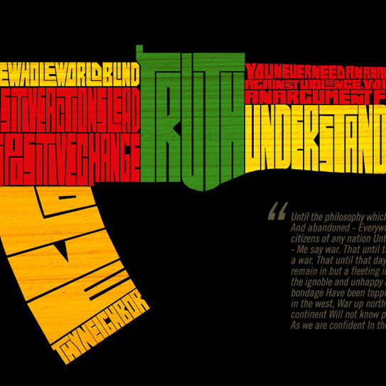
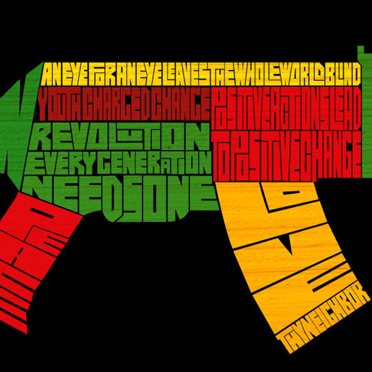
Revolution were looking for a logo board that they could use in their December 09 range and asked if I could work on one for them. As revolution are an activist brand I thought of a graphic that would be topical and emphasis the activist nature of the brand. I decided to use the image of an AK-47 on the deck, but make it up using words and phrases that promote peace and unity. If people around the world put those words into practice as often as they use guns I’m pretty sure we would be living in a much better place. I complimented the graphic with the words from the song “WAR” by Bob Marley, and then used the red, yellow, and green colours to compliment the Bob Marley lyrics.

peace_1

peace_2

peace_3

peace_4

06/11/09   TAGS: