Killer Team print ads

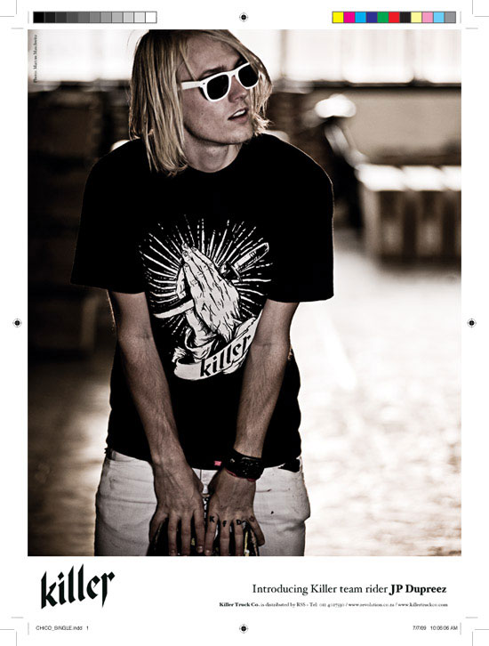
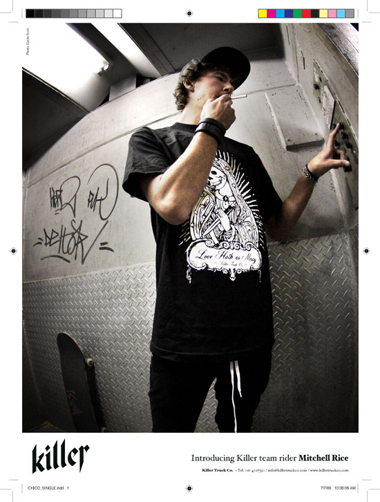
For this brief I was asked to design two print ads to introduce two of the Killer Ltd skate team members. The ads would be run in Session Skateboarding magazine and printed as posters. As the Killer brand is based around a lifestyle I decided to portray exactly that. We shot each rider in and around the Killer warehouse, just taking it easy and doing what they would on a normal day. The photos both portrayed each riders personality really well, and as a result gave a good indication as to what the brand is about. Both team riders also wore Killer T-shirts that were designed by myself.
killer_ad_1

killer_ad_2

13/11/09   TAGS: ,


Ladies Bicycle Workshops

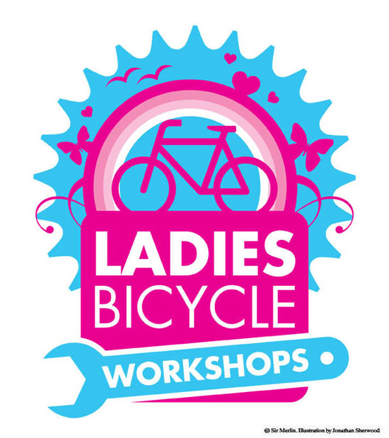
Gail and Nicola asked me if I would design the logo for their new venture called “Ladies Bicycle Workshops”. Ladies Bicycle Workshops are events for ladies where they can learn about bicycles, maintenance, and basic bike skills. With it being an all ladies affair I chose to use bright pinks and blues, and used tones to expand the colour pallet so as to keep print costs down. Incorporating elements in the design that communicated what the workshops were about as well as some decorative icons kept the logo both informative and fun.

LBW_logo

09/11/09  


Kicks + start (kickstart)

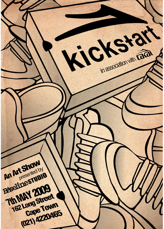
I designed this poster for an art show that Lakai Footwear was hosting. The show was called Kickstart (kicks + art), and involved a number of artists painting onto blank Lakai shoes and loafers. Because the shoes in this show were a blank canvas for the artists I tried to create a poster that put emphasis on the shoes, but also reflected that fact that they were to be used as part of the art. In doing so I illustrated the shoes so that they looked like a colour by number, and then used a rough canvas texture in the background. All of the information about the show was placed in shoe boxes so as to keep the focus on footwear.

kickstart

06/11/09   TAGS:


Revolution “Peace Weapon”

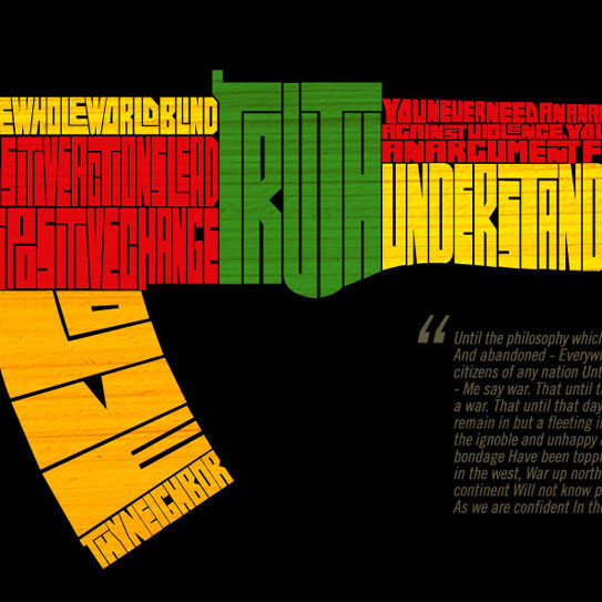
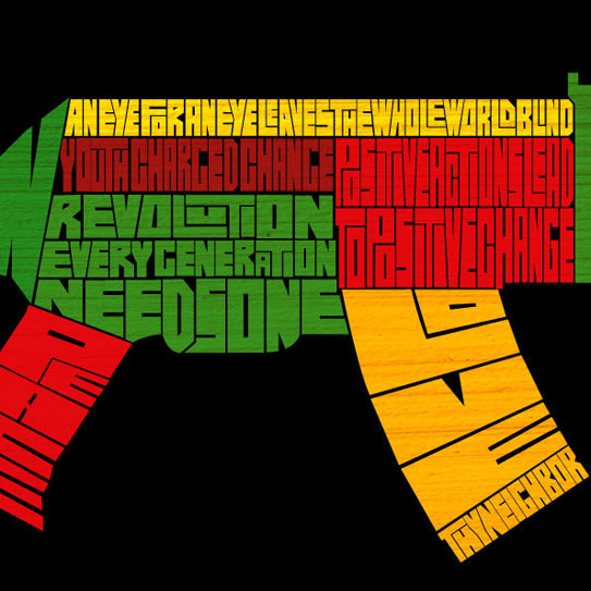
Revolution were looking for a logo board that they could use in their December 09 range and asked if I could work on one for them. As revolution are an activist brand I thought of a graphic that would be topical and emphasis the activist nature of the brand. I decided to use the image of an AK-47 on the deck, but make it up using words and phrases that promote peace and unity. If people around the world put those words into practice as often as they use guns I’m pretty sure we would be living in a much better place. I complimented the graphic with the words from the song “WAR” by Bob Marley, and then used the red, yellow, and green colours to compliment the Bob Marley lyrics.

peace_1

peace_2

peace_3

peace_4

06/11/09   TAGS:


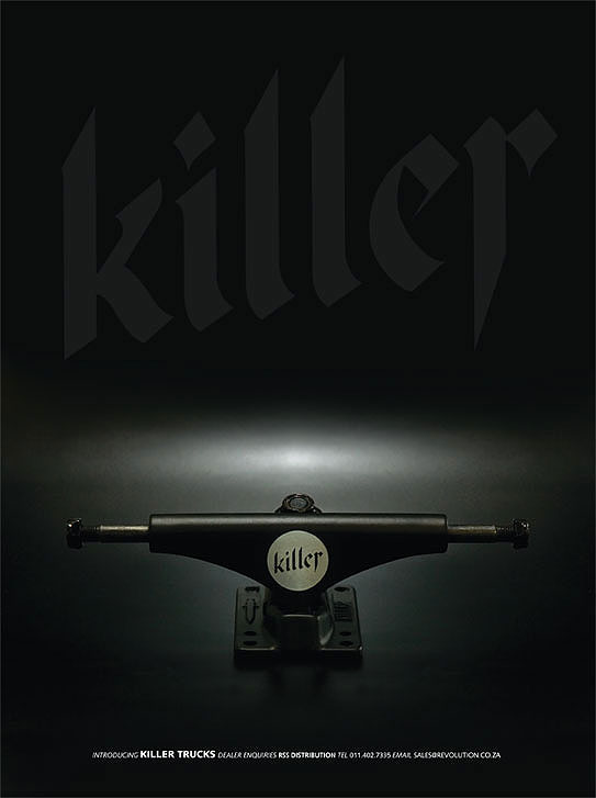
Killer Trucks print ad

This was the first print ad the Killer truck Co ran and was the first marketing they did for the brand. The focus was to be purely on the product (truck), and introduce people to the brand. In doing so I chose to shoot the truck on a dark background using lighting to punch it out of the page. I also decided to go big on the logo placement so as to drive it home amongst people who saw the ad. Feedback on the ad was great, and even the magazine editor presumed that Killer was a big well established international brand when we submitted the ad.

killer_truck_ad

06/11/09   TAGS: ,